Search Results for 'exacompta sketchbook'

Finishing My Second Exacompta Sketchbook

a filled Exacompta

*EDITED: I decided to include the images that I had previously posted, just to keep it all in one place. Enjoy!*

I purchased my first Exacompta sketchbook, and won my second from a Rhodia Drive raffle giveaway. (Remember how cute they were together?) I admit I had my doubts about using the same book twice… I tend to get a little claustrophobic with my art supplies if I’m not head-over-heels in love with them… and I did have few frustrations with the way that some of my more delicate nibs would catch on the Exacompta’s laid paper.

But now that I’ve finished that second book, I’d have to say it’s one of the best all-purpose books I’ve used thus far. In fact, I’m having a lot of trouble finding a replacement. I want many of the same characteristics: thick, unlined paper, a nondescript cover, and medium size. I’d like to have smoother paper this time around, though. And apparently, those requirements don’t come together too often in one book. I need to gather up the energy to bind one for myself again.

Here’s the visual summary:

ink therapy 🙂

testing Caran D'ache Museum leads

Exacompta Sketchbook

I posted about my new journal the other day, and have been trying to find some free time to post some pictures. Technically, I purchased the Exacompta sketchbook, not the matching journal, but I prefer to write on a blank unlined page.

In the past I’ve discussed my distaste for both the Moleskine corporation and the moleskine “culture,” and my transition toward making my own books. I’m still binding books for friends and for myself, but I wanted to experiment with a store-bought book that was:

  • of superior quality to moleskine (particularly the paper quality)
  • not overpriced
  • not over-marketed (i.e. no “legendary” claims)
  • produced by a fairly ethical company
  • classy, customizable, and unique.

Of course I know that no store-bought book is going to be unique, and it’s silly to make that claim about any mass-produced product. By “unique,” I really mean basic enough for me to fill, alter, and abuse it to the point where it becomes mine.

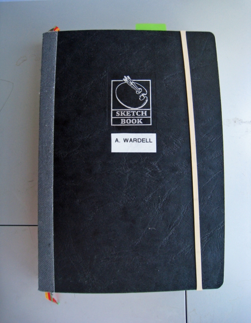
img_0734Enter the Exacompta sketchbook. By now I’ve spent a few weeks with this delicious book and I can say that it’s hands down my favorite store-bought basic black book (BBB).

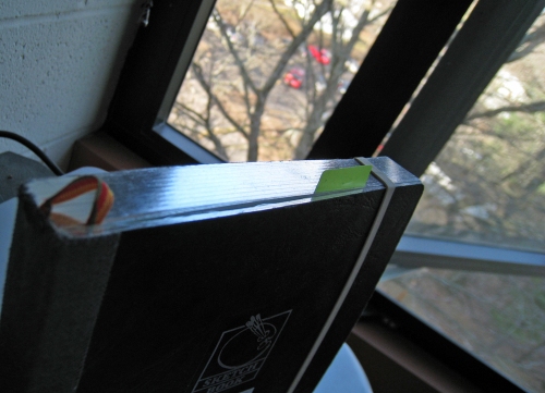
The sketchbook (5.5″x8.5″) is cloth bound, and sewn, so the pages open completely flat. A lot of small and medium sized books have trouble opening flat so this has been a total blessing for a carpal-tunnel-stricken scriptophile like me. I thought that I wouldn’t like the embossed “sketchbook” logo on the cover, but I’ve found that I don’t mind it too much. I added a label with my name to the front, and I’ve been holding the book closed with a plain rubber band.

The book is filled with gorgeous off-white laid paper. It’s lighter than moleskine-yellow, which means that my colors show up brighter. The laid lines result from the pattern of the screen against the paper pulp during the paper-making process. I really love the texture that these lines create because it reminds me that paper doesn’t just appear out of nowhere– it goes through a process of creation, beginning with harvested trees. I’m not enough of a treehugger to stop using paper journals (and besides, computer laptops have a larger carbon footprint than a Hummer, so paper journaling is not my greatest sin), but it’s good to be reminded that the products we use everyday don’t come from the store; they originate from nature somewhere.

img_0735

gilded edges

img_0739

img_0738

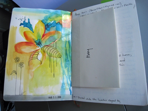
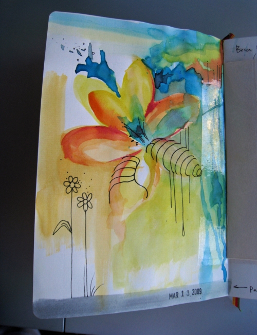
The paper takes well to my fountain pen, and also surprisingly to watercolor. I used my sister’s cheap watercolor set to play around a little while I was home over break. I had forgotten how neon those basic elementary school watercolor sets are! I’m looking forward to painting some more with my own set when I have the time.

Regarding my desire for a book “produced by a fairly ethical company,” I haven’t yet found any evidence one way or the other for Clairefontaine/Exacompta. I found a company profile, but there doesn’t seem to be much underground networking regarding their history. Nevertheless, I do know that their production has remained in France (not shipped over to China, a la Moleskine).

After searching a bit online, it turns out that a few others have discovered the beauty of this book before me: both Inkophile and Spiritual Evolution of the Bean raved about this sketchbook as well.

Kunst & Papier Sketchbooks

Have I mentioned that I’ve been working in a new book? After two Exacompta sketchbooks, I wanted to try something slightly bigger with a sturdier cover. So I ended up purchasing two Kunst & Papier sketchbooks from my local art supply store– a grey hardbound 6×7″ and a black softcover that I actually can’t quite identify on their site, but I photographed the labels below.

The Look. I was drawn immediately to the stunning textures of the covers. The hardcover is a synthetic linen,  They’re simple but tactile, and (my favorite part) completely free of logos or designs. I prefer my sketchbooks and journals to advertise nothing but myself. And although sometimes a blank cover just begs to be decorated, I think these look classiest when left alone.

The Binding. The hardcover sketchbook has a sewn binding while the softcover is glued. Actually, the K&P site tells me that the hardcover is “smyth sewn and gauze spliced bindings” –which sounds very fancy even if I have no idea what it means. Both, however, open beautifully, marvelously, flat.

The Paper. Both books are fountain pen friendly, but in different ways.  The K&P website says that the hardcover book contains acid-free alpha cellulose paper, but it also mentions chlorine-free “pH buffered lignen” –and if I’m not mistaken, cellulose and lignen are two different plant-derived materials. Hmm. In any case, the paper in the hardcover book is thinner and smoother, while the paper in the softcover book is a heavier weight (120g, versus 100g in the hardcover), but also rougher/more porous. So actually, even though the paper in the softcover book is heavier, it was more difficult to write on, and there was a bit of bleedthrough when I used a flex nib. Below is an example of writing with the same pen (a Pilot 78G with an italic nib) on the two different papers.


You can see on the first image that the “P” is uneven and jagged, while it’s much smoother on the second image (in the hardcover sketchbook).

In any case, I’ve been using the hardcover book for my last semester of college, and I’ve been extremely pleased with it. After the Exacompta sketchbook, I had to adjust to seeing my writing through the pages, but I’ve never had any bleedthrough so it doesn’t bother me anymore. I would also warn against using too much wet media, although I’ve used acrylic paint with some success. But in general, this is an excellent book for fountain pens and dry media, and the hardcover provides more sturdy protection than the Exacompta.

End of the Exacompta

Once upon a time there was a girl who decided to use an Exacompta sketchbook as a journal.

She wrapped it with a blue rubber band that originally held a bunch of asparagus, tucked some liberty stamps inside the cover, and set off. Over the next few months, she wrote a poem with her sister, added an ID label to the front cover, and test-printed her own hand-carved stamps. Postcards from a friend in Vanuatu began to accumulate inside the back cover. She tested all kinds of pens, and a great number of inks, inside its pages.

In short, she beat it up, bit it, scribbled it to death.

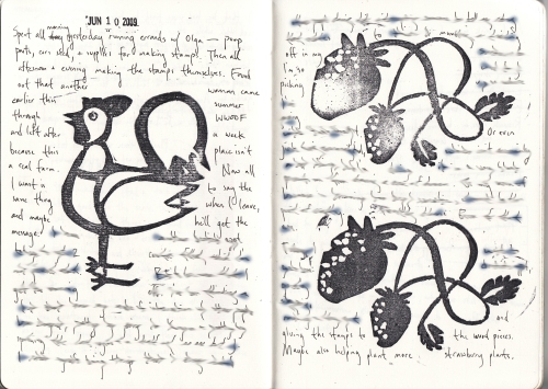
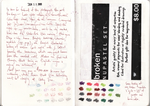
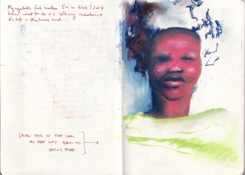
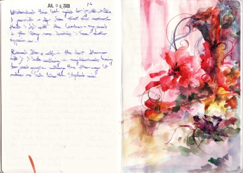
Some Selections from recent months

(click to view larger)

IMG_0004IMG_0003

Clearly, I don’t use fixative in my journal.

IMG_0006IMG_0002Alimenti watercolorIMG_0008

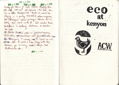
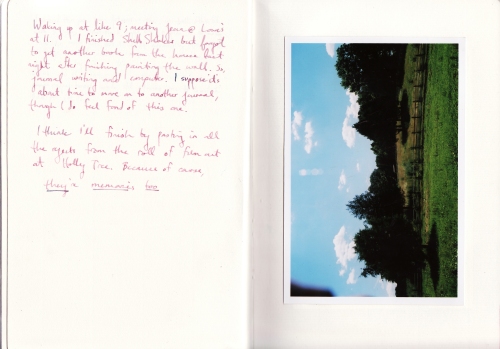
Latter half reads:

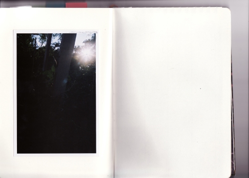
I think I’ll finish by pasting in all the rejects from the roll of film out at Holly Tree. Because of course, they’re memories too.

IMG_0007

On to the next book!

An Assorted (Yet Cohesive!) Paper Review

In this post, I outlined my initial impressions of four different Clairefontaine papers, which I received generously from Exaclair and bound into a short-term, multi-purpose book (what some people call a “journal”). I used this book during the last weeks of classes, as well as through the madness of Senior Week, and Graduation itself.

And it felt good (really good) to put this book aside after graduation– to start brand new, on a blank page. (What a handy metaphor, no?)

As it turns out, my blank page was on the other side of the country. But now I’m here in Colorado, and yes, I promised fuller reviews. So here we go.

Digital Color Printing Paper

Pentel Pocket Pen and ink on DCP Paper

First, to clarify: this paper isn’t meant for traditional writing and media. It’s for machines, and I’m sure it works superbly that way. But I’m not interested in machines (except, maybe, Leo Marx’s). I wanted to test a loose-leaf Clairefontaine paper– one that could be used for bookbinding!

This has perhaps been one of the few drawbacks to Clairefontaine products– they’re more like, well, office supplies than art supplies. So I really appreciate trying out some loose-leaf paper, which can be used as a raw material for a variety of art projects. The DCP paper is also available in a variety of weights (90 to 350 gsm), which allows for even more customization.

The short version: Use your fountain pens, markers, brush pens, and crayons on this paper; leave the paint and wet media alone. Water-soluble pencils/crayons/pastels have the potential to work well (perhaps if they’re more oil-based) but don’t overdo the water. Stephanie at Biffybeans did a review of this paper, and had similar findings.

Also, this is the time to experiment with bright colors. So channel your inner pop artist.

However, for whatever reason, I found that I did less art on this kind of paper. When I did draw, I used my Pentel Pocket Pen, which left beautiful, clean, high-contrast lines. Writing (in ink) on this paper was pleasurable, but the paper was too glossy to use a pencil, and the thinness also encouraged more minimalist approach.

Stamped! Notice the wet spot to the left; that's bleed-through from the drawing posted above

Continue reading ‘An Assorted (Yet Cohesive!) Paper Review’

Next Page »


Art adventures, literary hangovers, rural politics and other songs worth sharing.

Flickr Photos