Posts Tagged 'J. Herbin'

Mixing Up Summer Inks

Impending college loans have put me in a super-frugal state of mind. I haven’t bought any new inks in a while– but I have had some fun this summer mixing up remnants of the inks that I had.

The result? A veritable rainbow. Makes for very exciting writing.

Summer Inks on a Rhodia Dotpad

Survey, from top to Bottom

I. Aurora Black is a staple in my ink lineup. It’s not waterproof, which is unfortunate, but it’s just so. smooth. On the sexy end of the smooth spectrum, really.

II. I mixed this green– a combination of J. Herbin Vert Olive and Levenger Gemstone Green –for the first time in May, when I was writing a paper on Walt Whitman’s Leaves of Grass. It’s a wonderful dark olive green, professional and not too yellow.

III. This was a spastic mixing experiment, but I’m really pleased with the green-gray result, which is now in my Pelikan M400. I started with an anonymous dark blue that kind of resembled PR’s Black Magic Blue, and then added a lot of J. Herbin Vert Olive and J. Herbin Poussiere de Lune.

IV. I love J. Herbin’s Diabolo Menthe, but it’s totally impractical for writing. I added a few drops of PR’s Electric DC Blue, which darkened it to a lovely aqua blue and also made it flow better.

V. I’ve used this mix for a while to create the perfect mid-tone blue; it’s a combination of J. Herbin Bleu Pervenche and PR Electric DC Blue.

VI. I think I officially prefer to mix my own Burgundy’s, rather than buying them. I literally combined a ton of leftover samples of various blues and reds –and came up with this wonderful purply-wine color.

VII. This bright red started with Noodler’s Golden Brown, which I combined with a sample of Noodler’s Dragon’s Napalm, to which I added J. Herbin Rouge Carobier and J. Herbin Rouge Opera.

VIII. Diamine’s Poppy Red. Enough said.

IX. I wanted a good summer peach color, so I started with J. Herbin Rouille d’Ancre, and added some Diamine Poppy Red and J. Herbin Orange Indien.

J. Herbin Redux

I was pretty excited about some new J. Herbin inks when I made this quick post. So I was obviously a little embarrassed when the Quo Vadis blog decided to feature them in a post… yikes.

Anyways, after reviewing the Kalligraphie pad recently, I decided to revisit that concept and came up with this:

My Current Collection of J. Herbin Inks. And yes, I know Perl Noire is misspelled 😦

The thing about dip pens… is that they always show an ink to be more saturated than it really is. So I tried to smoosh them around a bit (professional terminology) to show their real range of color. When used in a fountain pen, these inks will write in the color that you can see in the smear.

The other thing about dip pens… is that they require a really saturated ink. They’re best used with India Ink, not fountain pen ink, which is less viscous (read: more watery). I’ve had some luck using Private Reserve inks in dip pens, but on the viscosity scale of fountain pen inks, J. Herbin is by far the least saturated, least viscous ink. So making this page was a total drip-disaster. That’s why there is some pretty uneven line work here…

I find that I use J. Herbin inks a lot with brushes, which I really enjoy. And of course, in pens. I currently have two pens inked with Cacao du Bresil, actually.

A Date with J. Herbin

Mile 39 of the Ink Marathon

A rainy day is a good day for blogging. Weather forecast says we’re in for a rainy week, so look for more frequent posts over the next few days…

Gems full

Gems c98dd5584ad1

Swisher Dark Purple (made by Noodler’s) is one of the few purple inks I think I could see myself using– at least, in color. It’s a blue-based purple with no shading, bright but not obnoxious. But how on earth does an ink bleed on Rhodia paper? Ah, yes, it’s a quick-drying ink, and such quick absorbency means that it will bleed. I’ll have to try this in a dry-writing fountain pen, and then get back to this review.

J. Herbin Encre Violette is, I know, only slightly different from Swisher Dark Purple. Yet for some reason I find it totally obnoxious, like a Barney purple. It’s nearly the same value as Dark Purple (i.e. equally dark), but less blue and more of a true purple. The smell of this ink, by the way, is nauseating.

Noodler’s Lermontov is from the “Russian series,” a set of inks which all have a strange, milky transparency to them. It’s as though they’re bright, even saturated, but still seem a bit transparent. Lermentov is a light purple leaning towards pink.

Noodler’s Akhmatova, also from the Russian series, is almost identical to Lermentov in brightness, saturation, and still strangely transparent. The only difference, of course, is that it’s kermit-the-frog green.

Levenger Gemstone Green falls into the same family as J. Herbin’s Vert Reseda, Diabolo Menthe, and Diamine’s steel blue. They are all true teals, and Levenger’s Gemstone Green is the darkest. Like other Levenger inks, it’s very saturated and has no shading.

Levenger Amethyst is like a darker, classier version of J.Herbin’s Encre Violette at the top of the page. Still a true purple, but deeper and more saturated– and, I would guess, more appropriate for Levenger’s clientele (i.e. conservative professionals).

Levenger Cobalt Blue is a true blue, which is something you don’t see often in inks. It doesn’t have the vitality of Private Reserve’s Electric DC Blue or PR’s Black Magic Blue, but it’s along those lines. To me, it just feels… basic.

J. Herbin Rouge Opera

2118168615_b3cb263bf8

"Show Must Go On" by Alselon

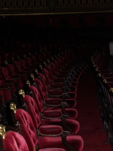
Ohh, I realized the color! J. Herbin’s Rouge Opera is the color of those plush velvet seats in old theaters. Or, a less intense version of various scenes in Moulin Rouge. So, that makes sense.

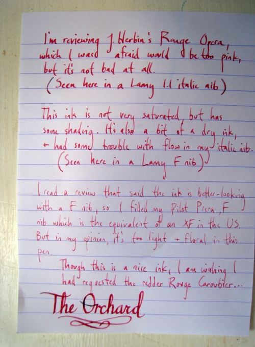
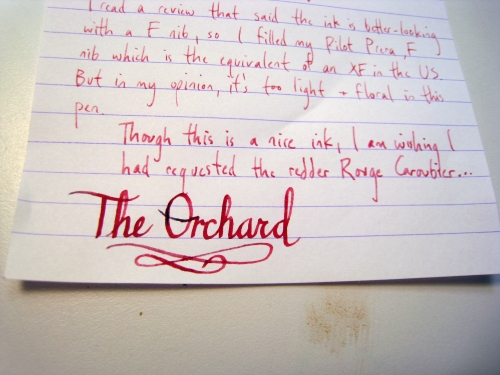
So, I received this from the ever-generous Karen Doherty through the Quo Vadis blog’s Bastille Day Giveaway. I tried this ink in three different pens: a Lamy Safari with a F nib, a Lamy Al-Star with a 1.1 italic nib, and a Pilot Prera with a F nib, which is the equivalent of an XF nib in the U.S. I read a review of this ink that said it looked better in a fine nib, so I figured I’d cover all the areas.

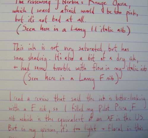
This ink is not very saturated, which is a general trend with J. Herbin inks. As a result, I tend to like their colors that are intentionally light, like Diabolo Menthe, and disappointed by their deeper colors… like this one. But it does have a bit of nice shading in the italic and the F nibs. In the Pilot XF nib, the ink was much too washed out and became a sort of dusty floral color.

RougeOperaThis photo makes it look a bit more saturated than it is in real life– it’s not nearly so neon.

Some inks look sort of cool when they’re washed out, but in this case it just looks too pink. And, um, I don’t dig pink ink. I’ll bet that it would look a bit better on cream or ivory paper, instead of the bright white. Perhaps using a wider italic nib than the 1.1 would also serve this ink well. Biffybeans reviewed this ink, and it looks much more purple than mine, especially on the ivory paper.

RougeOpera3RougeOpera2

This ink also had a dry start when I first tried it in with the italic nib. Which might have been a fluke, because other J. Herbin inks have worked just fine in that pen. I think I should have requested Rouge Caroubier, which is supposedly a bit more of an orange-red instead of a pink-red. Ah, well!


Art adventures, literary hangovers, rural politics and other songs worth sharing.

Flickr Photos